Anthropological research on color has long approached color in relation to language. Berlin and Kay’s (Reference Berlin1991) widely known work and their revisions in the universalist tradition (Kay et al. Reference Kay1991) questioned how color term variation across cultures are possible with respect to universal human sensory capacities and, later, human biological conditions. Challenges to these works by the relativists critiqued the theoretical assumptions guiding these inquiries (Saunders Reference Saunders2000), especially how they approached the relation between language, reality, and thought with views on words as maps of referential reality (Lucy Reference Lucy1997). More recent humanistic research in the Anthropology of Color (MacLaury et al. Reference MacLaury2007) shows that color terms still figure large in investigations into color perception and cognition, including studies that venture to explore color semiosis in commercial and industrial practices (Bergh Reference Bergh2007; Stoeva-Holm Reference Stoeva-Holm2007). Color, as Kay (Reference Kay1999, 32) noted, has been “the empirical domain par excellence” for thinking about linguistic relativity. Semiotic anthropological researches might revisit color as a traditional topic yielding new insights, in alignment with contemporary humanistic researches attending to the linguistic and nonlinguistic sign relation in explaining general semiosis of color in society.
This article explores the semiotic formation and use of nonce color terms, namely, commodity color names in South Korea, with a view toward showing how color terms are used not to reference color but as codes shaping socioeconomic scalar interpretations. In South Korea, cosmetics is an industry continuing to grow with more than half of the local market dominated by two major conglomerate corporations that each own roughly 20–25 brand companies or cosmetics lines.Footnote 1 Meanwhile, the Korean language is rich in its color term vocabulary and also highly flexible with respect to new term formation. Linguist Seongha Rhee (Reference Rhee2019, 126) argues, for instance, that, at the phonological level, language offers the ground for an “elaborate iconic relationship between the perceived state of affairs and linguistic coding via sound symbolism.”
This article focuses on flexible color term production in the marketing practice of attaching “fancy” (Skorinko et al. Reference Skorinko2006; see also Miller and Kahn Reference Miller2005) color terms to products that have a wide spectrum of selections to choose from (e.g., paint colors, ice cream flavors). Here, color names used by four cosmetics companies that are all technically owned by one single conglomerate will be compared as to their semiotic construction. These names are, as will be shown, created in part in order to textually represent some realities or qualities perceivable of color and labeled accordingly so as to distinguish different shades on a spectrum.
Meanwhile, these linguistic constructions also reflect upon the usefulness of separation of language from what they refer to, that is, the detachability of name from color. Silverstein explains of indexical icons as “emblems with consubstantial intensional content or stuff with respect to their original contextual surround, little detachable design elements that are like ready-made texts deployable for social-interactive effect and which preserve their intensional characteristics as a seemingly autonomous ‘code’ of meanings” (Reference Silverstein1998, 316). Commodity color names examined here are such emblematically constructed names. I show below that the indexical iconic features of these expression quasi-systematically contain elements that organize the mediatized semiosis (Agha Reference Agha2011) of color terms at relatively larger social and economic scales through the use of elements that metasemiotically relate color with color-wearing personhood or more precisely femininity, as well as with economic consumerhood.
In the following sections, I first discuss the semiotic ideologies surrounding the production of fancy color terms in the South Korean cosmetics industry. I then explore how color cosmetics products (e.g., lipstick) of four companies of an umbrella corporation are named. Names are compared using a semiotic componential analysis method. An analysis of the production and selection of color names shows that different names are designed to appeal to different age groups of females—ranging from the very young, through relatively young adults, to more mature consumers. In short, commodity color names at the product level create distinctions between shades but furthermore produce a “scaling” of femininity (Carr and Lempert Reference Carr2016). Later, it is revealed that the semiotic process of emblematizing and commodifying colors via linguistic constructions inversely relate to the pricing or rescaling of those who can purchase such verbalizable colors.
Commodity Color Naming Ideologies
The crowded streets of urban Seoul are embraced by retail shops welcoming sidewalk visitors, and in almost every local commercial zone one is apt to find small franchisee shops of the cosmetics companies. The two major cosmetics corporations in Korea, AmorePacific and LG Household & Health Care, started diversifying product lines into separate cosmetics brands/companies around the beginning of the twenty-first century, and this business strategy accompanied the emergence of what are called “road shops,” which allow passersby easy access. Not all brands have road shops as sales routes, and not all brands are road shop brands. Franchise shops are a relatively new sales venue compared with high-end department stores, specialty shops, televised home shopping, and door-to-door sales; and the venues in which cosmetics brands are sold is linked to who the main customers are. Recently, road shop sales are said to have been in decline and online purchasing is correspondingly increasing overall, but, unlike other cosmetics items (e.g., skin care), color cosmetics are said to be items that are preferably purchased offline.Footnote 2
As part of my earlier research, I visited fifteen road shop stores of one of AmorePacific Corporation’s road shop operating companies, “Pink Castle” (a pseudonym, hereafter referred to as “Pink”),Footnote 3 to gather ethnographic data on in-store use of its product color terms (Koh Reference Koh2016). What piqued my interest in Pink Castle—a brand that uses the color pink strikingly and lavishly in storefront façades, in-store décor, product packaging, salesperson uniforms, and so on, and whose brand vision is to promote “makeup as play”—was how names such as “might not be orange” or “flamingo heart” that confuse reference to color for an average native Korean speaker help characterize color relative to teenage color-term users.Footnote 4 In online commentaries populated by teenagers, Pink Castle is known for its unique naming practice and comments such as the names being “funny,” “strange,” “bubbly,” or made by “hard working, drug-induced, marketing people” are easily locatable in a quick search. One can also find online community site threads wherein hundreds of commentators engage in speech play, mimicking how the company names its color cosmetics products. The color names of Pink Castle in essence tend to borrow linguistic elements and speech features more likely found in Korean teenage females’ utterances (fig. 1), and their unordinary and exaggerative use to coin shades produces casual comments that the names are strange and cute.
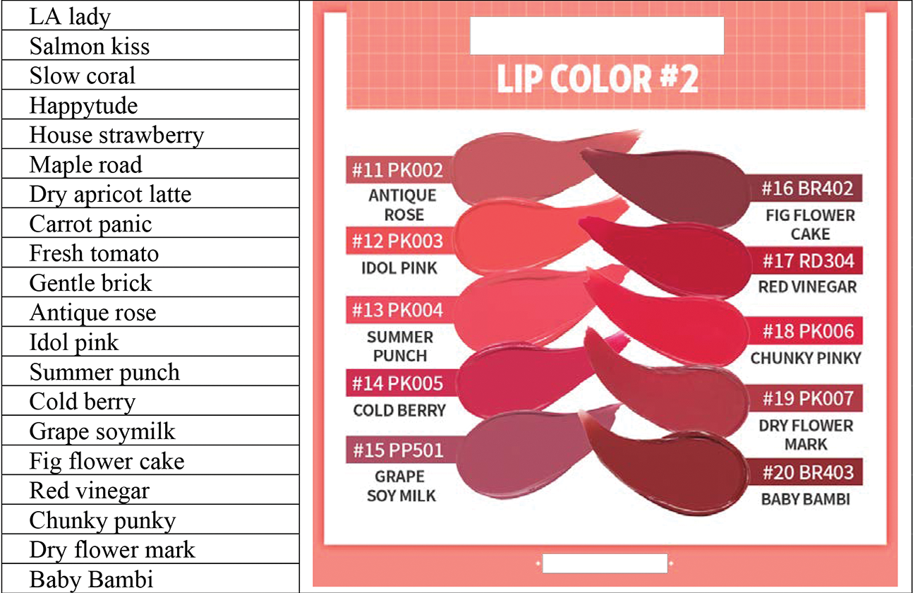
Figure 1. Sample color names from a lipstick line of Pink Castle (image from official “Pink Castle” English Facebook page, posted January 29, 2018; company name intentionally concealed).
In offline road shop stores, however, little importance seems to be attached to these fancy names. In interviews with Pink Castle salespersons, the names of lipsticks, eye shadows, or nail polishes were not considered much more than mere labels—that is, the names are created by marketing personnel, who do not recall or use these names in in-store conversations with customers. A salesperson whose English nickname shows on her nameplate as Rachel (which was printed in pink font) said, “we make everything pretty here, so the names are cute and funny. Since everything around here, you see, are all pink pink.” Dalia at another store tried explaining more thoughtfully that it seems like “names are important in color cosmetics. Think of Tonymoly’s ‘cat’s meow.’ Since what we’re selling are actually color and mood.” Road shop clerks periodically receive customer service education. But training sessions do not include information pertaining to the make or use of color names. What clerks are taught rather is information about the felt qualities of cosmetic products or how to approach customers using familiar descriptive terms (e.g., “reddish” tone, “sticky” feeling) that help customers understand cosmetics and narrow down their selections.
In South Korean government and industry documents, expert discourses, and AmorePacific Corporation’s marketing discourses, two semiotic ideologies coexist and shape ideas on what color terms are and how they are used. The first is what might be called a semiological ideology governing standardization of terms. In this view, names are seen as labels for one-to-one referencing of color. The Korean Ministry of Trade and Industry, in an announcement regarding the release of 2009 standard names, writes that “standard” terminologies are developed to “help people identify color and easily verbalize and communicate [what they seek to reference].”Footnote 5 The document further states that terms are systematically created through the institutionalized color labeling system (e.g., Korean “digital color palette”) in order for “everyday color term users to properly point to the exact” color and avoid miscommunication.Footnote 6 Under such an ideology, existing systems of color codification such as the Munsell Color System that uses numbers and a single alphabet or a combination of the two are “transduced” (Silverstein Reference Silverstein2003) into language, or more accurately into words with modifying adjectives (e.g., “7.5R 5/14” versus “light pink”).Footnote 7
Now this view governing standard color term production differs slightly from another that sees terms rather as codes expressing qualitative sensory experiences and that the above quoted interviewees at Pink Castle echo. At Pink Castle, the goal of color naming at the marketing and branding stage, according to a magazine interview of a marketing staffperson, is to “create brilliant, playful names” that reinforce the overall brand identity, names that hopefully induce “sympathetic” responses.Footnote 8 The marketing staffer used the example of a lip color line focusing on the color orange (fig. 2), saying that a shade she “wasn’t sure was orange” was named to “reflect” that subjective interpretation. One road shop clerk I interviewed also used the example in figure 2, commenting that “if you take a close look, [the names] are like the shade gradations,” implying that names can be seen as corresponding to perceptual qualities of shades that are distinguishable on a color spectrum.

Figure 2. Color terms as expressing sensory experiences (image captured by the author from an advertisement).
The view that guides the production of nonce color terms in cosmetics marketing, like that which governs standard color term production, is also quasi-semiological in that language is held as signifier expressing signified meaning and deriving value from the capacity to distinguish shades. The difference lies in what color terms are understood as representing. While the former ideology holds color terms as linguistic translations of systemic codes, the latter marketing view holds them to be expressive of visual and sensible qualities of colors. But color terminologies created either way both have at the textual level the explicit goal of using language to assist everyday communication between participants. Clarifying how novel and fancy color terms can bring about communicative effects requires closer examination of the role of mediatized semiosis in their production and use.
Scaling Shades and Codifying Femininity
To discuss how nonce color terms can produce interpretations that make sense and are contextually useful, it is necessary to shift attention to the question of for whom they are coined. In Pink Castle brand’s case (vis-à-vis three other brands discussed shortly), names such as “for now orange” or “still orange” in figure 2, for example, take their forms not so much to represent common color impressions per se, despite the rationalizations discussed above. What the Korean speaker is more likely to notice is how these names depart entirely from standard and everyday color term vocabulary and from terms that permit precise side-by-side comparison on a single-color spectrum.
Like its brand mission to promote makeup as play, this company’s color names are formed in effect to reinforce a sense of playfulness and charm; this goal is achieved partly by creating an interpretative distance between common expectations of typical color lexicalization patterns and perceptual qualities of color. In addition, at the micro term-formation level, there are certain linguistic features used repeatedly in Pink Castle’s names that liken color terms to forms of colloquial Korean spoken most commonly by female youth. Word play including homophonic puns (e.g., “chunky punky,” and “happytude,” which is a play on “attitude”) or tongue twisters is common and indexes positive, cheery youth sensibilities. At the word level, nouns and modifiers employ commodity registers linked to youth consumption patterns (“idol pink”) or those expressive of female youth sensitivities or desires (“salmon kiss”). These linguistic features taken together form semiotic units that make possible understanding of the company’s color terms as sounding “cute”—like a popular image of female teens in South Korea, whoms the company targets as its primary consumer group.
The concept of mediatization in recent decades has been receiving wide social science attention (Hiramoto and Park Reference Hiramoto2010; Hjarvard Reference Hjarvard2014). In semiotic anthropology, Agha (Reference Agha2011, 163) early on unraveled it as a “special case of mediation” whereby institutional forms of social practices “link processes of communication to processes of commoditization.” The manner in which shades in South Korean cosmetics commodities are coined with respect to circulating cultural discourses of colors (as well as color consumers) can benefit from this explanation. Commodity color terms are linked to stererotypic images of potential consumers. This motivation is accomplished through a combination of two separable activities—one in which the typical Korean speaker’s expectation of what a color term should be is manipulated vis-à-vis visually sensible properties of color, and a second in which text-level construction selectively embeds bits of linguistic elements, indexically branding colors as consumables of certain groups distinguishable on socioeconomic spectrums.
In figure 3, the names of representative lip product lines in four of AmorePacific’s companies are compared. Data are controlled by limiting selection to the names of the top-selling lip product lines for each company at the time of collection. The company pseudonyms here—“Gold,” “Black,” “Skyblue,” “Pink”—take after each company’s brand color (fig. 3); it should be noted that all the examples (except some of Pink’s) are composed of English loanwords and transliterations. In a quick impression survey I conducted with Korean undergraduate and graduate students, Pink company is seen as making things “cute” overall; Skyblue as giving the impression of “purity” and “cleanliness”; Black as more “modern,” “chic,” and “sensuous”; and Gold as presenting a more “gorgeous” or “mature” female image. Also, while Pink’s terms are taken to be “unlike” commonly used language, the sense that terms depart from everyday language decreases slightly in the case of the shade names of Skyblue, a brand that targets people in their twenties, and also of Black, which targets those in their late twenties to midthirties. Finally, in the case of the Gold company, a brand favored by relatively older females in their midforties, the color names are taken to be rather bland.
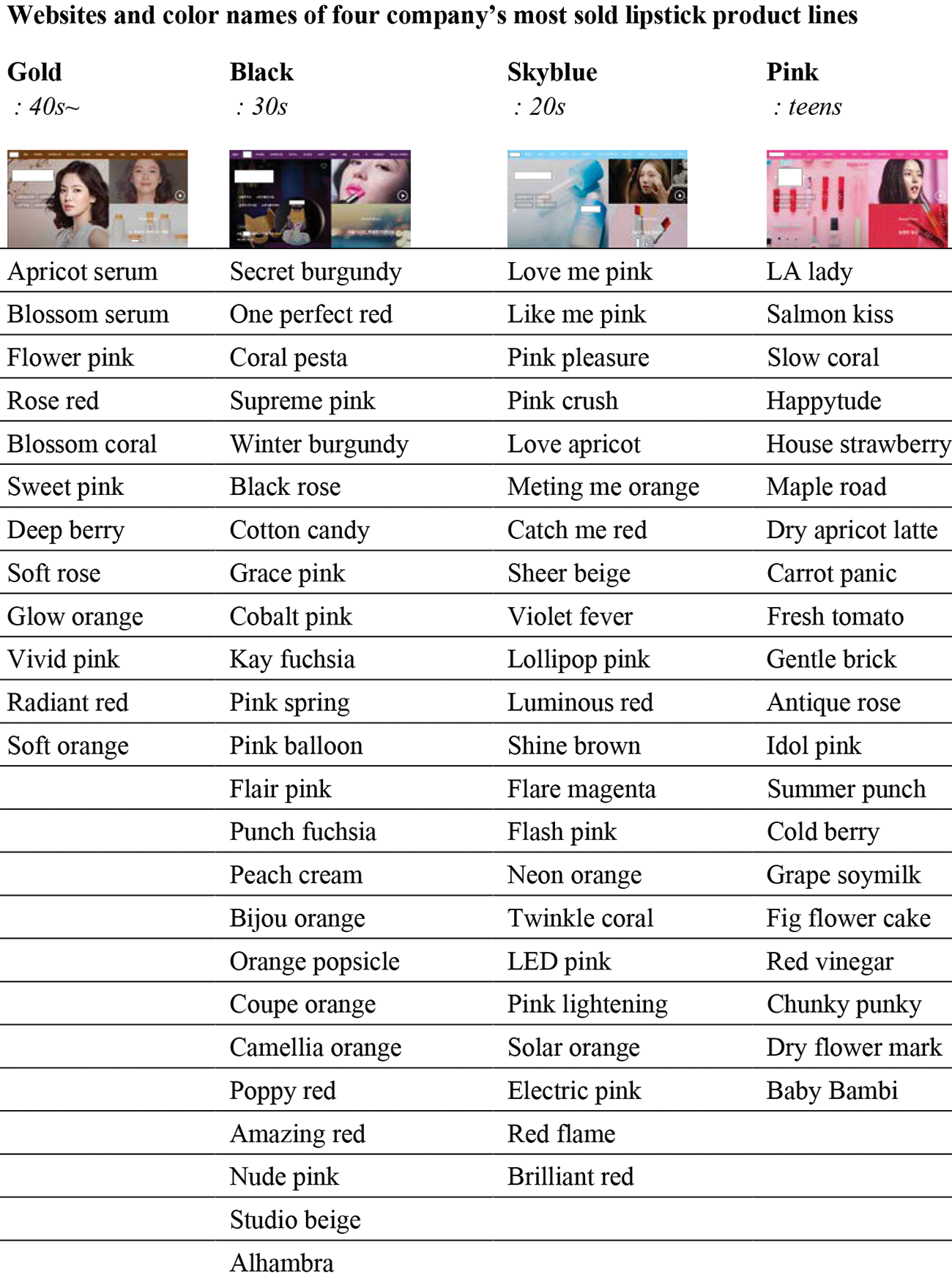
Figure 3. List of shade names of popular lip product lines of four companies (images captured as screenshots from official company websites).
What is the basis of such native speakers’ judgments? In figure 4, I extract and compare several semiotic features embedded in the four companies’ color names. What is shown is that the company that has teens as its main customers is the only one that uses Korean, albeit partially. As noted earlier, Pink often uses words referencing consumables including food, taste, pop culture, for example, tan-p’ung ‘maple’ Footnote 9 and mu-hwa-kwa ‘fig’. Wordplay is also particular to this company’s names. On the other hand, in both Pink’s and Skyblue’s names, especially in the latter’s, pronouns and forms of address (e.g., you, me, ŏn-ni ‘older sister’), and words expressing certain types of relational affect are used (e.g., “melting+me,” “like+me”). Meanwhile, the brand Black, which depicts fashionable or chic thirty-somethings as an ideal feminine type, uses environmental or place names, rather than the social relational words typically found in Skyblue’s names. None of these indexical features are inserted into the names of the Gold brand, which simply relies on often-heard English loanwords and transliterations for their construction.
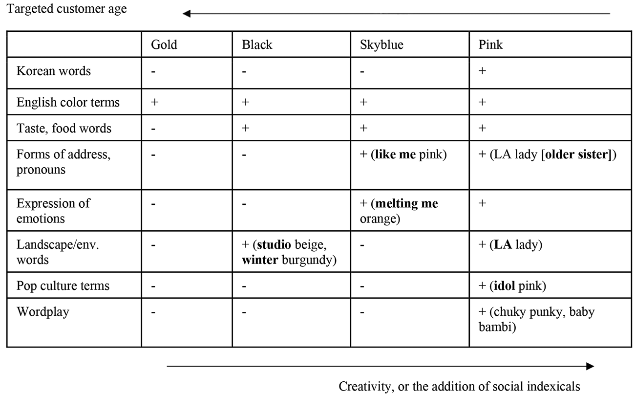
Figure 4. Semiotic componential analysis of commodity color names
In sum, what can be seen through a comparison of semiotic elements that work together to form these terms is that the degree of creativity inversely relates to the mean age of customer groups primarily sought by each company/brand operating within a single corporation. That is, the more creative, fancier, or less standardized the color terms are, the younger the possible color users are—and conversely, the older the average consumers are, the closer the commodity color terms are to commonly used Korean color-term vocabulary.
Creativity in or the nonce-ness of terms here then simply means their departure from culturally understood norms of color term constructions. But this scaling of creativity at the color-term text level reflexively relates to the likely consumers of commodity colors, thus acting as the semiotic ground for bringing about a “characterological framework of commodity ‘use’” (Agha Reference Agha2011, 176). At the intersection between text-level and commodity-level formations, commodity color terms as units are made emblematic signs with various elements semiotically indexing and metasemiotically resembling the discursive habits, preferences, and orientations of different groups of female populations.
The Pragmatics of Scale Making
How significant are color terms when talking about their uses in contexts of color consumption? How do we make sense of such elaborate linguistic constructions for things such as lipstick, especially when their use for color referencing in commodity exchange situations are infrequent? Among the ten or more salesperson clerks I spoke to, two mentioned that fancy names can be “occasionally useful.” Located at different shops, both shared their experiences with an identical eye shadow shade called “takeout without syrup.” They remarked that high school students “like the name because it’s similar [to how they speak],” that entering into shops, they “immediately ask for ‘TWS’” (using the acronym), and that while they themselves are not familiar with most of the names, they “do know TWS because customers say [the name] so often.”
In order to understand the role of commodity color terms and to make sense of their social semiosis, it is helpful to focus on how they are formed as part of a larger commodity formulation. There are of course many kinds of semiotic elements (e.g., in packaging, advertising) that factor into the making of commodities and that contribute differently to the social life of mediatized and mediatizing things. Here, the focus is limited to color terms, but to explain how the emblematization of color names at the text level and the commodity formulation they give to the product in relation to its consumers factor into the overall commodity make-up, I consider now what is happening at the level of economic value making.
Figure 5 charts the prices of each of the four companies’ popular lines of three cosmetics types—lipstick (chart line in red), eye shadow (blue), and skin toner (yellow) products. While semiotic componential analysis of linguistic labels in this article is limited to lip products, the socioeconomic scaling tendency in these companies’ pricing is similar across product types. Remarkably, the compared companies/brands are firmly differentiated within the larger AmorePacific corporate umbrella, with the prices of all three commodity types increasing as the mean age of targeted female customer groups rises. That is, the scale of commodity price and that of the commodity consumers’ mean age work in iconic resemblance across the compared companies/brands. Now, these scaling patterns work in an exact opposite fashion to the scale of creativity found in color names. So the higher the prices are and the older—or should we say the more “gorgeous” and “mature”—the ideal image of the customer female population is, the more standard and the more ordinary the color terms used, which for consumers point to actual color—rather than to subjective emotions or social relationships of cosmetics users—as their semiotic meaning. Conversely, the younger the consumers are and the cheaper the products are, the more apt we are to find color terms that depart from standard color terms and, instead, index the social contexts or circumstances of color and color term use.
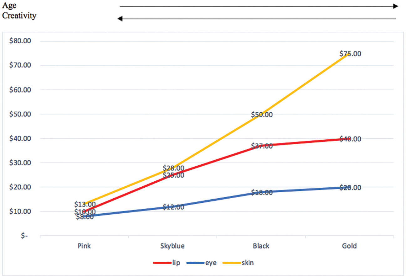
Figure 5. Socioeconomic scale-making in the formation of commodities
Conclusion
To sum up, in identifying and examining different kinds of linguistic and semiotic components selectively and creatively employed to represent color in four different South Korean cosmetics lines, in this article, I sought to reveal how linguistic signs function to “mediate” (Parmentier Reference Parmentier1985) the relationship between, while also differentiating, people and things (i.e., color and commodities). This function of color terms depends on the use of language as a medium that indexically links things (such as cosmetics) with the stereotypic qualities of people. In pragmatic semiotics, in turn, this linguistic mediation entailed a scaling of females into age sets and then a scaling of those differentiated female groups into different sets of customers with varying degrees of purchasing power. We might call this the “performative effect” of color term naming and mediatized usage, which linguistically creates stratifications among colors, products, and people by reclassifying things into cheap, moderate, and expensive high-end products and persons into consumers of correspondingly weak, moderate, and strong purchasing power.
