
Emily Dickinson wrote that:
The books in this book – here pictured on the second of two white shelves, much repainted – are frigates of a special kind (Figure I.1). Each is an illustrated twentieth-century reprint of a nineteenth-century novel. That is, these are new editions of older novels, graced with wood engravings or inked drawings, written in one century and illustrated in the next. While much of the history of the book tends to focus on the original edition of any given novel, most purchasers, borrowers, and readers of noncontemporary books experience them in editions that, like these reprints, are resonant with the years accumulated between initial publication and republication.
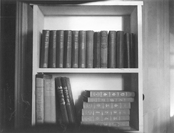
Figure I.1 “Bookshelf,” Andrew Miller, 2017.
With straw-brown bindings and robin’s-egg-blue boards, that thick volume second to the left is a reprint of Thomas Hardy’s The Return of the Native (1878), published in 1929. It is clothed in the colorations of a fragrant summer day on Egdon Heath, the setting of the novel and the inspiration for the British wood engraver Clare Leighton, who illustrated its landscape in full-page tableaus and tiny head- and tailpieces.2 With gilded titles and unusually large formats, the two slimmer volumes leaning against Hardy’s novel are Emily Brontë’s Wuthering Heights (1847) and Charlotte Brontë’s Jane Eyre (1847), which at their republication in 1943 would have been packaged in a single slipcase in the same forest green used for their bindings.3 Their front covers feature engravings by the German-Jewish artist Fritz Eichenberg, the first with an image of Heathcliff, braced against a tree, and the second with Jane, trailing across the frame with a group of identically dressed girls. With grey-blue spines, gilded lettering, and brightly colored patterned-paper boards, the stack of books to the right of the Brontës’ novels is The Folio Society’s 1975 set of The Complete Novels of Jane Austen. In them, the British master engraver Joan Hassall elucidated a miniscule world of brightly gesticulating characters, chance encounters, and verdant hills.4 Unpictured here but also central to the story of this book is a silver-gilded edition of Herman Melville’s Moby Dick (1851), illustrated in 1930 with pen, brush, and ink imitations of wood engravings by the American artist Rockwell Kent, who channeled his own many sea adventures into the craggy swells and surfacing whales of the novel.5
Leighton, Eichenberg, Hassall, and Kent took voyages real and imagined to Hardy’s heaths, Emily and Charlotte Brontë’s moors, Austen’s drawing rooms, and Melville’s oceans, and also transported those authors’ books forward to new landscapes and contexts. In so deftly combining and recombining text against image against personal experience, they provided an invitation to their readers to do the same. While they were far from the only illustrators to take up the nineteenth-century novel in the twentieth century, they did so with particular attention to the gap of time between their subjects and their images, and with an especially rich approach to the material possibilities of wood, paper, and ink. Mediators between text and book and author and reader, these artists interpreted these novels and then illustrated their interpretations, stunningly and strangely. Theirs is the art of the reprint.
To study the wood-engraved reprint is to trace several interlinked stories: of a changing book industry, briefly enamored by the manner in which wood engravings connoted prestige and nostalgia; of an emerging engraving movement, which allowed extraordinary artists access to a much wider audience than had previously been possible; and of a growing readership, newly able to acquire books. In the early decades of the twentieth century, reprints of nineteenth-century novels – wood-engraved and not – had proliferated at such a rate that Virginia Woolf opened a 1925 review of new editions of works by Charles Dickens with the following reflection:
Like the ripening of strawberries, the swelling of apples, and all other natural processes, new editions of Dickens – cheap, pleasant-looking, well printed – are born into the world and call for no more notice than the season’s plums and, save when by some chance the emergence of one of those masterpieces in its fresh, free binding, suggests an odd and overwhelming enterprise – that one should read David Copperfield for the second time.6
Easily available, seasonally marketed, and freshly bound, reprints felt almost ridiculously abundant. Editions of nineteenth-century novels in particular had been increasing in quantity and quality since 1900. Many publishers, like the British firm Chatto & Windus, had been around since the nineteenth century and were continuing to publish books from their backlists. For others, like Routledge’s Railway Library, Bohn’s Shilling Library, Cape’s Travellers’ Library, and the Run and Read Library, it was a boon that the greats of the mid-nineteenth century ceased to be copyrighted around the turn of the century. The years between 1900 and 1906 saw the launching of Nelson’s Classics, Grant Richards’ World’s Classics, Collins’s Pocket Classics, and Dent’s Everyman’s Library. Some, like Modern Library, which began publishing classics in 1925, would thrive for many years afterward and be incorporated into larger publishing houses.7 More often than not, these imprints released books that readers would already be familiar with, as in the case of Hardy’s The Return of the Native, Charlotte Brontë’s Jane Eyre, Emily Brontë’s Wuthering Heights, and Austen’s six completed novels. But sometimes they helped nudge books onto lists of classics that might not have been there in their own century, as in the case of Austen’s juvenilia and incomplete works, published in Hassall’s set as Shorter Works, and Melville’s Moby Dick, which Kent’s editions helped popularize at a moment when interest in the novel was growing.8 All capitalized on the fact that old texts were (and are) by and large less expensive to produce than new ones. These were low-risk endeavors.9 Depending on how fancy the edition, a classic novel could be published with or without a new introductory note or set of illustrations. Whether plain or embellished, these new exteriors (and interiors) helped the classic masquerade as new; or, to extend Woolf’s metaphor, they allowed the prune to be a plum.
Wood-engraved illustrations were one way – along with new bindings, striking front covers, and watercolor and ink illustrations – to present the classic in a new guise. But the wood-engraved reprint in particular is something of an accident of history. A carved woodblock is a very old form of reproduction – Walter Benjamin cited it as the first medium of graphic reproduction – that by the twentieth century seemed nearly archaic.10 In the nineteenth century, wood engraving was seen as a secondary or supplementary skill, done in large quantities for books, periodicals, and newspapers. An illustrator would draw on paper and then an engraver would transfer that image to wood. This was the primary means of reproduction until 1900, when most publishers were able to achieve the same effects as wood by switching to metal and halftone printing. Largely because wood engraving ceased to be of interest to commercial publishers, it was primarily artists curious to develop a craft sensibility who took up the medium. While as early as 1883 the etcher and printmaker Sir Francis Seymour Haden encouraged a return to original work and technique, it took almost fifty years for it to become common practice.11 In 1925, the artist and engraver (and teacher of Clare Leighton) Noel Rooke said: “There is only one way of getting a thoroughly satisfactory engraving: the designer and engraver must be one and the same person.”12 By then, as Albert Garrett, James Hamilton, and Patricia Jaffe have described in their histories on the subject, a print revival was in full swing in Britain, with corollary movements in America and Germany. As one illustration-focused issue of Studio put it in 1931: “The old simple cutting has been turned into something like engraving, but has kept its antique solidity. Dots and fine lines are freely used to suggest form, while at the same time massed blacks and whites preserve the effect of almost flat perspective.”13 A new crop of engravers, which was far from aesthetically coherent, had in common a much more playful relationship to line, dot, shadow, and shade. And though fascination with the medium lessened in the following decades, this renewed interest in wood engraving, combined with technical innovations in photoengraving and book printing, produced each of the works in this book. And though those works were published between 1929 and 1975, all of the artists who illustrated them emerged from some version of an early twentieth-century print revival.
Because of the conjunction of the print revival and mass mechanical reproduction, artists and publishers were able to make great art newly accessible to more people than ever before.14 As British engraver Dorothea Braby put it, “Collaboration between all concerned – author and publisher, engraver and typographer, papermaker and printer – working in close harmony, resulted in the production of beautiful books.”15 Most especially, these books were born out of a willingness on the part of publishers to commission truly exceptional and often niche artists as illustrators. Leighton noted the unexpected nature of this change in an essay:
It is especially interesting to see that it is not the flashily attractive artists who are engaged to do these things, but those who might be considered to be too esoteric to please the general public. This is a most hopeful sign, for there is no doubt that if the unschooled public be given the chance continually to see around it works of art of good dynamic design, it will grow to understand and enjoy them and to demand them.16
To Leighton and to many other artists who had rediscovered wood engraving, this was an exciting moment, one in which artists who might once have been thought too obscure for a mass audience were being brought to the forefront of the publishing world. Moreover, that shift amounted to an education of the everyday consumer of art. Leighton and Kent in particular were among a group of British and American artists and engravers – Vivien Gribble and Gwen Raverat among them – who brought the illustrated reprint into the homes of a new category of private readers. Where only several hundred or so art books might be printed in any given run, Leighton’s The Return of the Native (1929) had a print run of 1,500. Much larger print runs became possible in the 1930s. Published just a year after Leighton’s reprint, Kent’s Moby Dick (1930) was packaged both as a collector’s edition and as a trade selection by the Book-of-the-Month Club. Kent was able to reach both the collector and the everyday reader. Just a couple of years later, John Farleigh’s illustrations for the first edition of George Bernard Shaw’s The Adventures of the Black Girl in Her Search for God (1932) made stunning use of the contrast between ink and paper. Its front cover features a Black woman only distinguished from an entirely inked page by the use of a few slender white lines.17 That edition exemplified the wood-engraved book’s transition from limited edition to wide release.18 By the 1940s, when Eichenberg’s books were commissioned, the wood-engraved reprint had gained the prestige of a craft medium and the popularity of a more widely distributed art form.
Two imprints, The Golden Cockerel Press and Penguin Illustrated Classics, one with a very small distribution and one with much larger ambitions, are indicative of the trajectory of the wood-engraved illustrated reprint during this period. Robert Gibbings founded The Golden Cockerel Press in 1920 as a home for very short runs of handmade editions of contemporary and classic texts illustrated with wood engravings. Like Leighton, Gibbings had studied with Noel Rooke and was keen to reach a wider audience of readers, which is why in 1937 he became the first art director of Penguin Illustrated Classics.19 Penguin Books had been founded just two years earlier on the premise that small paperbacks should be as cheap and accessible as packs of cigarettes. At a time when smoking was very common, these books were meant to be an everyday purchase.20 Their iconic three-blocked, two-colored, orange-white-orange covers became emblematic of a mass-market approach to publishing, packaging, and distributing contemporary literature. Penguin Illustrated Classics was envisioned as a similar operation. It would print classic rather than contemporary novels and its books would feature excellent wood-engraved illustrations commissioned by Gibbings. Each edition combined the ease of a pocket Penguin with the wit and artistry of something that might have been commissioned at The Golden Cockerel Press.21 When the imprint released an initial run of ten numbered reprints in May of 1938, it included novels by British and American authors like Jonathan Swift, Daniel Defoe, and Edgar Allen Poe, with illustrations by artists like Douglas Percy Bliss, Gertrude Hermes, and Theodore Nash. Gibbings even engraved his own illustrations for Melville’s Typee (1846).22 Each cover was done in the usual Penguin-style coloration, but with a twist: two slim vertical bars of orange framed a wide white central bar onto which was printed an image from inside the book. The importance of the interior engravings was further emphasized on the back of each book, which advertised all the volumes in the set with the names of the illustrators included.
The first of the ten books published by Penguin Illustrated Classics was Austen’s Pride and Prejudice, illustrated by Helen Binyon.23 Its front cover featured a small, energetic image of Mrs. Bennett, her apron strings fluttering in the wind, waving Jane, neatly appointed in a tiny hat, off to Netherfield. In a composition that interestingly decentered Darcy and Elizabeth, Binyon detailed a column for the house in thick vertical lines, grass in minute horizontal dashes, a path arching from foreground to background, and a storm gathering in the sky, foreshadowing poor weather and Jane’s illness. This is also the edition’s first interior illustration, printed, like all the rest, with text running above and below it, so that image is integrated into story. In the remainder of the book, Binyon engraved the novel in vibrant black and white, in images like one of Elizabeth standing at the edge of a ballroom, peering into the assembly of soldiers and gentry, with she in vivid detail and they pale and blurry below the very bright light cast by two chandeliers; of Elizabeth with her aunt and uncle at Pemberley, she delicate in white and surrounded by climbing vines and branches and leaves of all different shapes, they focused on the splashing stream below, Pemberley grand in the background; of Elizabeth and Jane, anxiously racing to meet Mr. Bennett, who holds in his hands a letter with news of Lydia; and of Elizabeth and Lady Catherine tense in front of a “prettyish kind of a little wilderness,” dark trees in the background.24 With attention to the novel’s entire cast of characters and to the whole of its plot, Binyon made Austen’s story come alive in a charming and accessible style. Choosing this novel to be the first of Penguin Illustrated Classics’s batch of ten books suggests that Austen was of primary importance to readers of the transatlantic canon. Austen’s stories and characters, combined with Binyon’s visual interpretations, were meant to inaugurate a new era in mass craft printing and reprinting.
The complete massification of the wood-engraved imprint, however, never came to fruition. Penguin Illustrated Classics’s winning combination of British and American literary and artistic culture might have been profitable in the long run, but because of World War II shortages the imprint was cancelled in 1939, just a year after it launched. Those original ten books are all that is left of it. Engraver Gwen Raverat, who had illustrated number two of the set, Laurence Sterne’s A Sentimental Journey, saw the imprint’s closure as the end of an era.25 The market for such illustrated editions was shrinking and larger publishers had stopped producing them. Instead, the wood-engraved reprint remained a smaller, more prestige portion of the publishing market, albeit one with much wider distribution than would have been possible in the nineteenth century.
This meant that rather than having the trappings of, for example, a hypermodern-looking Penguin paperback, the reprints described here were more likely to have the look of a nineteenth-century book. Despite tighter bindings, fewer embossed covers, as well as different paper quality and typeface choices, these books were designed to evoke nostalgia for the less massified century in which they were first written. They were published between 1929 and 1975 but were bound in aged Victorian blues and greens and gilded with gold lettering, so that they looked both older and more valuable than they were. In America, such touches also survived. In 1949, a book designer complained: “Far too many of our American books speak with an English accent.”26 Kent’s editions, for example, which were designed to be pieces of Americana, still lived in some relationship to British type and paper (which were imported from Britain) and aesthetic (because he was inspired by British printmaking and poetry). His editions of Moby Dick, along with Leighton’s Return of the Native, Eichenberg’s Jane Eyre, and Hassall’s The Complete Novels, were designed and marketed to look unique and like no one else could possibly own them but were actually accessible to a new kind of everyday reader and buyer of books.27 Great books were now for everyone.
Just as the everyday person was becoming a bigger buyer and consumer, there was an urgency to better describe and evaluate the kind of reader they might become. As early as 1858, in his essay “The Unknown Public,” Wilkie Collins described a new category of readers: “a public unknown to the literary world; unknown, as disciples, to the whole body of professed critics; unknown, as customers, at the great libraries and the great publishing houses; unknown, as an audience, to the distinguished English writers of our own time.”28 Collins’s essay was a harbinger of a cultural reckoning with an ever-larger public of readers, one that would be picked up in the 1920s by, for example, Virginia Woolf, F. R. Leavis, and Q. D. Leavis, and then in the 1950s by, for example, Richard Hoggart and Richard Altick (with many other authors tackling the subject in the intervening years).29 In their different ways, many of these critics had in mind Matthew Arnold’s 1869 definition of culture as “a pursuit of our total perfection by means of getting to know, on all the matters which most concern us, the best which has been thought and said in the world.”30 One way to understand the historical moment that begins this book is that it coincides with when the Arnold school – of highly educated professional critics – felt that it was losing control of the culture that they had so long been arbiters of and when Collins’s unknown public – of less well educated nonprofessional readers – was on the rise, along with the publishers, book clubs, and illustrators who catered to them.
During this time period, Virginia Woolf’s thinking about the everyday reader and the classic novel underwent an illustrative evolution. She addressed the general reader’s relationship to the reprinted nineteenth-century novel in “On Re-Reading Novels” (1922), a review of new editions of novels by Jane Austen, the Brontës, and George Meredith. After introducing the editions – which with the exception of the Meredith volumes were all illustrated – Woolf wrote: “Some … mood of exasperation and bewilderment, of violence, yet of remorse, is abroad at the present among those common readers whom Dr. Johnson respected, for it is by them, he said, that ‘must be finally decided all claim to poetical honours.’”31 Woolf suggested that if the everyday reader were the one to determine literary legacy – the books that remain important to us long after their authors and eras have passed – then the culture at large was out of luck. Or, even worse, in some kind of danger. Her language, of exasperation, bewilderment, and violence, is quite extreme. “Somehow or other these fat Victorian novels,” she wrote, “these Vanity Fairs, Copperfields, Richmonds, and Adam Bedes must be read finally, if we are to do them justice – must be read as one reads Hamlet, as a whole.”32 These big fat novels – which, she points out, take much longer to read than Hamlet – needed somehow to be read finally, to be read as one reads Shakespeare’s greatest plays, with an awareness of how good and how important they are. When Woolf wrote, the very idea of a canonical nineteenth-century novel (and of Dickens being on a par with Shakespeare) was relatively new. Mere decades before, these had simply been the most popular novels of their time. This, then, was a complex moment of legacy-making. Woolf, like other Modernist authors, was grappling with the novels of her parents’ generation. And to her, in 1922, the mere release and reading and rereading of new reprints was insufficient to secure their place in the canon.
By 1925, Woolf had left her earlier skepticism about the common reader behind. The same year that she wrote about the bounty of berry-like nineteenth-century reprints newly available to the everyday reader, she published The Common Reader. With essays on a wide range of authors and literary works, it was a culmination of thinking that she had been doing over the better part of a decade. She prefaced the collection by quoting the same Samuel Johnson line that she had cited in “On Re-Reading Novels,” but in a very different context:
There is a sentence in Dr. Johnson’s Life of Gray which might well be written up in all those rooms, too humble to be called libraries, yet full of books, where the pursuit of reading is carried on by private people. “… I rejoice to concur with the common reader; for by the common sense of readers, uncorrupted by literary prejudices, after all the refinements of subtilty and the dogmatism of learning, must be finally decided all claim to poetical honours.” …
The common reader, as Dr. Johnson implies, differs from the critic and the scholar. He is worse educated, and nature has not gifted him so generously. He reads for his own pleasure rather than to impart knowledge or correct the opinions of others. Above all, he is guided by an instinct to create for himself, out of whatever odds and ends he can come by, some kind of whole – a portrait of a man, a sketch of an age, a theory of the art of writing. He never ceases, as he reads, to run up some rickety and ramshackle fabric which shall give him the temporary satisfaction of looking sufficiently like the real object to allow of affection, laughter, and argument.33
Bringing in slightly more of Johnson’s language, Woolf was now, as he had been, rejoicing with common readers rather than doubting their abilities. Her new figuration of these readers was more expansive, more empathetic, and more curious than the one articulated in her previous essay. These new common readers were less exasperated, more enthralled, less remorseful, more joyful. They read for pleasure and to create a kind of whole: a portrait, sketch, or theory. And that, Woolf implied, was enough – and indeed is a lot, since it is how literary legacy is truly formed.
Because in The Common Reader and its sequel The Second Common Reader (1932) Woolf wrote about literature from Chaucer to Joseph Conrad, her common reader is seldom specifically attached to the nineteenth-century novel and certainly not to the reprinted nineteenth-century novel. But many of her essays do concern nineteenth-century novelists – Jane Austen, Charlotte and Emily Brontë, and Thomas Hardy among them. Moreover, because the term “common reader” made its first appearance in her published vocabulary in “On Re-Reading Novels,” it serves as a useful championing of the everyday reader’s ability to tackle big, newly reprinted nineteenth-century tomes. Between 1922 and 1925, it had become less crucial to Woolf that nineteenth-century novels be read “finally,” as she had said in “On Re-Reading Novels,” than that they be read again – freshly, newly, as the strawberry-like Dickens reprints were.
Many critics begged to differ. At a moment when academics were seeking to make a scholarly field out of literary culture, I. A. Richards pilloried what Francis Mulhern has described as the “belletristic subjectivism that held sway in literary criticism” – or exactly the personal mode of reading that Woolf put forth in The Common Reader.34 In his Mass Civilisation and Minority Culture (1930), F. R. Leavis, Richards’s colleague at the University of Cambridge, argued that Matthew Arnold’s heady cultural values were difficult to uphold in an era of mass consumption. Leavis saw the literary market that I have just outlined as one in which “the accepted valuations are a kind of paper currency based upon a very small proportion of gold.”35 He was concerned that in leaving behind the aesthetic judgments of experts – of the Arnolds and Leavises – readers might be misled to read the worst and not the best of what has been thought and said in the world. In so arguing he, as Rachel Bowlby has described, figured the consumer as an easily manipulatable dupe of the advertising industry.36 Another researcher of the habits of this new, supposedly vulnerable public of mass readers was Q. D. Leavis, F. R.’s wife and frequent (and frequently uncredited) collaborator. In her Fiction and the Reading Public (1933), a historical account of British readerships from, roughly speaking, Shakespeare to Woolf, she argued that over the course of the nineteenth century “the great novelists of the age pass out of the common reader’s field of vision.”37 Leavis identified the Victorian era as the staging ground for both the disappearance of a previous version of the everyday reader and the entrance of a new, less educated version of that same figure. To her and to her husband, this was a problem in urgent need of a solution.
To the book industry, this was less a problem than an opportunity. The common reader can, as critics from the Leavises to Richard Hoggart to Julian Barnes have pointed out, be an elusive figure.38 But for twentieth-century publishers and book clubs, this reader was not an abstract topic of debate or research but a person to be found, wooed, and marketed to. From 1906 to 1935, every book published by Everyman’s Library began with ornate endpapers reminiscent of a William Morris print and an inscription from the fifteenth-century play Everyman:
An everyman’s library is a library for everyone. It will “go” with you, accompanying you, and also “guide” you, pulling you along. Book, reader, and canon interact complexly. Founded in 1926, the Book-of-the-Month Club, which distributed Kent’s Moby Dick and Eichenberg’s Jane Eyre and Wuthering Heights, defined the classic as follows in the issue of its magazine that announced the Brontës’ novels: “The characteristic of a literary classic is that it can be read on so many diverse planes of enjoyment by so many different kinds of people. Even the same reader, as his moods change, may find that a classic gives him quite different pleasures from one day to the next.”40 A classic was a book that could be enjoyed by a diversity of people. Indeed, by the same person, in many moods and circumstances. Pleasure and canonicity here were entirely individuated, as was suggested in Woolf’s preface, and as both Joan Shelley Rubin and Janice Radway have explored in their scholarship on book clubs.41 Founded in 1947 by three men who had come up in the 1920s publishing scene, The Folio Society, which distributed Hassall’s The Complete Novels, described itself as a home for “editions of the world’s greatest literature in a format worthy of the contents, at a price within the reach of the everyman.”42 This is not the consumer as dupe, but the reader – or everyman or everyday reader or common reader – as a powerful force in the making and remaking of literary legacy. In this everyday reader’s version of the canon, the best that had been thought and said in the world could without harm be reprinted through new editions and circumstances. Not just without harm but with benefits: the process of reinvention made visible in each of the books I describe here was a sign of the vitality of a novel and the imagination of its illustrators and readers.
To read is to recreate a novel within your own point of view and context. “He is thus a novelist,” Michel de Certeau suggested of the reader. To illustrate a novel in wood is to make materially manifest that highly subjective creative experience. In his Pleasure of the Text (1973), Roland Barthes wrote:
If you hammer a nail into a piece of wood, the wood has a different resistance according to the place you attack it: we say that the wood is not isotropic. Neither is the text: the edges, the seam, are unpredictable … so structural analysis (semiology) must recognize the slightest resistances in the text, the irregular pattern of its veins.43
Illustrating, editorializing, introducing, packaging, marketing, buying, reading, and shelving books are just so many modes of finding the edges of a text. In particular, twentieth-century artists illustrating nineteenth-century novels literalized Barthes’s metaphor by engraving their experiences of texts. Working through the slightest resistances and irregularities of story and wood, they revealed the process by which they navigated text, time, and block. In The Return of the Native, botanically specific plants and an oft-repeated country road speak to Leighton’s observational walks through Dorset and her repeated readings of Hardy’s novel. In Jane Eyre, the rough, gouging lines in Eichenberg’s images are telling of his (and Jane’s) alienation and displacement. In The Complete Novels, the tiny, detailed, anachronistically styled prints of the Georgian social world belie the intense, arthritic labor that Hassall carved into them. Exceptionally, in Moby Dick, Kent’s dramatic prints of sea, sky, whale, and sailor are in fact pen, brush, and ink drawings, printed to approximate the look and feel of wood engravings. Kent’s experience of the novel was best expressed by imitating the drama and craft nostalgia of the woodblock print. However, when he depicted a stormy horizon, a nearly capsized boat, or a whale foaming up the ocean surface, his lines became messy, loose, and squiggly, suggesting a drawing rather than an engraving. He dropped his emulation of the woodblock in those moments when he most needed the flexibility of drawing. And yet, for him – as for Leighton, and Hassall – the concept of the woodblock was essential: each notch or line was a part of an emerging story.
Wood is an especially compelling medium through which to chart the experience of reading a novel. Like reading, wood engraving is intimate. It requires no studio. It can be done at home, alone. Made with a few gravers, a block of wood, a sandbag, light, ink, and paper, a wood engraving carries traces of the labor that made it. When Joan Hassall gave a lecture to explain wood engraving – which is distinguished from the wood cut because it is carved from the more expensive end grain of a woodblock – she held up a polished, unengraved block of wood and said:
The action is to contract your hand so that the side part of your hand pushes the tool, the thumb being free and used as a guide. You push the tool, and a little fine white hair of wood comes out of the surface. If that block were printed, those three lines just engraved would come out white on black, and I want to emphasize that a wood-engraver really works from black to white.44
Working with gravers that she kept in a bright green roll of felt tied up with a shoestring, Hassall would press and manipulate the wood.45 Were she to ink the entirety of the block, she pointed out, its impression would be just a square of black. Were she to ink it and then to drop a hammer onto its surface, it would be a black square with a white dent on it.46 Type and engraving share the mechanism of relief printing.47 Every single speck, line, or cut on a woodblock lifts white out of black. “This is the medium in which one brings light out of darkness with each line of the graver,” Clare Leighton said, recalling how her love of Impressionist painting influenced how she created light in her prints.48 Eichenberg, too, spoke of the importance of light: “As you face the blank woodblock or the darkened surface of a lithographic stone, you create life out of it by throwing with your first touch of the graver – the first touch of your etching needle, or razor blade. You create a source of life that spreads over the whole scene.”49 He described the suspense of watching an image emerge, almost of its own volition, as if his block were a photograph being developed or even an organic growth out of the wood.50 The woodblock was a site of revelation.
Take, for examples, two renditions of a scene from Emily Brontë’s Wuthering Heights, one by Clare Leighton and one by Fritz Eichenberg. Each is a striking transcription of reading-in-wood. In the scene, Nelly Dean, the novel’s sometime narrator, ventures outside of the Grange just after the sun rises on the dark night of the soul in which Cathy gives birth and then dies. Nelly is on the lookout for Heathcliff, who had insisted on spending the night outside, and had made her swear to bring him news of Cathy. In fulfillment of her promise and his, Nelly finds him leaning against an aged ash tree, his hat off, his hair soaked in gathered dew. He instinctively knows that she is going to tell him that his childhood love has died, and, after conversing briefly with Nelly, turns toward the tree: “He dashed his head against the knotted trunk; and, lifting up his eyes, howled, not like a man, but like a savage beast being goaded to death with knives and spears. I observed several splashes of blood about the bark of the tree, and his hand and forehead were both stained.”51 In Leighton’s engraving of this scene, made for her 1931 edition of the novel, she imbued both figure and landscape with desperate fury (Figure I.2). Her Heathcliff has two cowlicks that spring from his head like devil’s horns. His right hand, which she detailed up until his fingertips but no further, seems to have a claw-like clutch on the tree, which is a swath of absolute blackness where he holds it. Behind him she engraved smaller trees and elucidated tiny blades of grass and twisting brambles and most imposingly the heath, swelling roundly in the background. For his 1943 edition of the novel, in an image that was featured on the front cover, Eichenberg illustrated nearly the same moment, though in his composition Heathcliff faces away from the tree instead of toward it. He shoves his angular chin up into the sky and tenses his body into the tree behind him as if to keep from being swept away (Figure I.3). Above him, branches stretch menacingly downward. What Leighton detailed with botanical specificity, Eichenberg depicted with expressive swaths of nearly unengraved wood that seem to contort with the agony of the scene. Where Leighton anchored herself in the natural world, Eichenberg worked in broader, more emotional strokes. Their engravings make apparent the ways in which they explored the world of Brontë’s story in the material of their woodblocks, becoming, in a sense, latter-day novelists of Wuthering Heights.
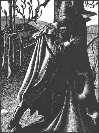
Figure I.2 Heathcliff, Clare Leighton, 1931.
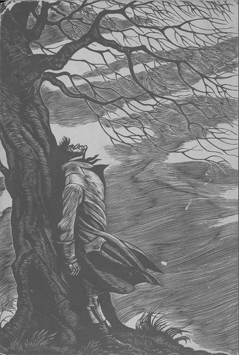
Figure I.3 Heathcliff, Fritz Eichenberg, 1943.
Literary-critical interpretation, which we might see as first developing in its contemporary form exactly when these reprints first started coming out, when Woolf wrote The Common Reader, and when Richards and the Leavises were at the University of Cambridge, can strip or dissect its subject. As Susan Sontag wrote in “Against Interpretation” (1966), “To interpret is to impoverish, to deplete the world – in order to set up a shadow world of ‘meanings.’”52 But here in these twinned images of Heathcliff, and also in their other illustration projects, Leighton and Eichenberg did something very different from that. They fulfilled what Sontag suggested should be the actual goal of commentary: “The aim of all commentary on art now should be to make works of art – and, by analogy, our own experience – more, rather than less, real to us.”53 The nature of illustration, which is that it runs alongside of text, means that it is fundamentally additive. This is interpretation as a special kind of illumination.
Both these images, and all the ones I look at in this book, demonstrate and open up the ambiguities inherent to novels and novel reading. Far from pinning down or depleting meaning, they loosen and enrich it. In the part of the novel illustrated above, Nelly surmised that based on the quantity of blood on Heathcliff ’s hands and head, “probably the scene I witnessed was a repetition of others acted during the night.”54 Or, so Nelly thinks – she is only “probably” correct and witnesses only one moment completely. She narrates through her own assumptions, just as Leighton and Eichenberg illustrate through their own lenses. They can only posit their own versions of this character and of the heath. And we, in turn, sort through these entangled assumptions, building from Brontë, Leighton, and Eichenberg our own interpretation of the novel, our own (as Woolf might say) rickety and ramshackle versions of Wuthering Heights. Because, for example, Nelly says that Heathcliff might have spent the entire night dashing his head against the tree, it is impossible to tell if the images by Leighton and Eichenberg illustrate Heathcliff ’s awful night or his awful morning. Nelly is ambiguous and so are they.
If our understanding of Emily Brontë’s scene and of Heathcliff ’s experience must always be somewhat conditional, then there is a kind of profound accuracy to a pair of somewhat similar and somewhat different prints by two twentieth-century artists – and to having a whole canon interpreted for us by artists with very specific points of view. Like Nelly and like us, these illustrators were translators of a mysterious story that was outside of reach, so nested was it within the multiple narrations of Brontë’s novel. And, like her and like us, they could not be more than forensic interpreters of emotions, gestures, and behaviors. Their engravings were transcriptions of those interpretations, each flick of the graver a clue discovered, a choice made, a detail noticed, a gesture invented.
Wuthering Heights – and really any novel, and certainly all the novels I look at – is highly responsive to being illustrated. One principal tenet of this book is that artist-readers act upon books, changing them. Another is that books act upon illustrations, shifting their meanings. Visual or pictorial or ekphrastic elements in literature, for example, may be highlighted by illustrators, but they may also speak a kind of theory of seeing back to the illustrations. Accordingly, in the chapters that follow I will attend to how Hardy’s bursting heath lives next to Leighton’s flora and fauna and Austen’s lightly drawn landscapes next to Hassall’s sweeping hills. Ishmael will instruct Kent in the proper depiction of whales and Jane Eyre will teach Eichenberg how to read. J. Hillis Miller said of a Charles Dickens novel and its illustrations that “Each illustrates the other, in a continual back and forth.”55 Miller was describing the close one-on-one collaboration that Dickens and George Cruikshank maintained over several years and several book projects. Such a contemporaneous relationship was not available for Leighton, Kent, Eichenberg, and Hassall to have with Hardy, Melville, the Brontës, or Austen. These artists and authors participated in Miller’s back and forth but also in something else, something more temporal.
Because it remakes the classic novel, the thoughtfully designed reprint is a tool for better understanding the past, with the hindsight of the present. Lewis Mumford famously announced that “Each man will read into Moby-Dick the drama of his own experience and that of his contemporaries … Each age, one may predict, will find its own symbols in Moby-Dick.”56 Every era remakes its books. Leighton, Kent, Eichenberg, and Hassall indelibly transformed their novels by reading through place, person, era, geography, and biography. They illustrated with the kind of hindsight that Simon Dentith has defined as memory at its most “active and diligent, engaged in what can seem like a ceaseless task: the effort to come to terms with, to make sense of one’s own past.”57 They were coming to terms with the characterizations, narratives, perspectives, and landscapes of a past literature through the lenses of their own experiences. As a result, The Return of the Native became a parable of lost landscape, Moby Dick a twentieth-century adventure saga, Jane Eyre an antifascist treatise on individualism, and Jane Austen’s novels theses on how to bring the past into the present through intense attention to detail.
Like readers and literary critics today, these artists searched the past for details and clues that might make literature feel more alive in the present. From essays, memoirs, autobiographical fragments, self-portraits, and sketches, it is clear how thoroughly Leighton, Kent, Eichenberg, and Hassall researched elements of the nineteenth century that were unfamiliar to them, like labor practices, whaling ships, costumes, textiles, and the contours of heaths. Indeed, the artists and publishers behind the books I write about here were keenly interested in fusing text and image. Kent’s editor used that word, “fusion,” and Hassall’s said that her illustrations felt married to the language of Jane Austen’s novels.58 Not every reader will pick up Leighton’s Wuthering Heights and think: here is a set of white-line engravings – it must be a product of the British print revival. Or read Eichenberg’s Wuthering Heights and think: here is a distorted and angular scene of Heathcliff and Cathy – it must be a product of German Expressionism. What reads to some as disjunction might just as well read to others as conjunction. As such, the art of the reprint can be read as simultaneously cleaving and collapsing the distance between initial publication and later illustration. Eras glint off of each other in unpredictable ways.
Each of the following chapters features a single artist and either one or several of their illustration projects. To write a holistic account of a handful of editions, their authors, makers, illustrators, and readers, I draw from scholarship on art, literature, the book, the consumer, and the reader, as well as from a transatlantic culture of printmaking and publishing. This is what Leah Price might call “the backstory by which books reach their readers,” with an emphasis on the richness of even just one reprint’s backstory.59 Because these artists had diverse interests and fascinating lives that spanned much of the twentieth century, this is also a book about world war, landscape, self-portraiture, adventure, immigration, socialism, identity, textiles, and whales.
I begin in Chapter 1 with Clare Leighton (1898–1989) and her 1929 edition of Thomas Hardy’s The Return of the Native. When she engraved illustrations for the novel Leighton said: “I was Egdon Heath, feeling the hooves of the cropper ponies and the turn of the undergrowth.”60 She was this land, that road, those flowers. She was precisely in the place of Hardy’s book, embracing the layering of the fictional and real that her act of creation entailed. The passage of time and the trauma of World War I (in which she lost her brother Roland Leighton, the subject of Vera Brittain’s 1933 memoir Testament of Youth) might have suggested a need for nostalgia, but Leighton’s images of a prewar, preindustrial landscape were very much rooted in the present. She took Hardy’s England as a telescope into a rural, land-based life that she further explored in her accounts of creating a working garden and farm, Four Hedges (1935) and Country Matters (1937). In analyzing her take on The Return of the Native, I pay particular attention to how differently she treated her full-sized illustrations, which were narrative and text-based, and her head- and tailpieces, which were more observational. The alchemy of these two kinds of images mimicked Hardy’s plotting, which also oscillated between character and landscape.
In Chapter 2, I focus on Herman Melville’s most famous illustrator, Rockwell Kent (1882–1971). When he designed and illustrated Moby Dick in 1930, Kent was at the same time writing and illustrating his own book, N by E, an account of his recent misadventures on the crew of a small boat sailing to Greenland. In both projects, Kent depicted ship, ocean, sailor, and creature with obsessive accuracy. Such a devoted socialist that he donated a trove of paintings to the Soviet Union in 1960 even after revelations about the regime had disillusioned many of its supporters, Kent was also a keen observer of the coastlines of Maine, Newfoundland, Alaska, and the Arctic. The specificity of his knowledge and the fervor with which he sought out adventures shows in the inky, fantastic tableaus and head- and tailpieces that he made for Moby Dick. His edition coincided with and helped solidify Melville’s canonization in the twentieth century – the so-called Melville Revival – while also reaching a new kind of reader through the Book-of-the-Month Club. His was perhaps the most beloved American illustrated reprint of its time, and certainly the best known of the reprints examined here.
In Chapter 3, I consider how Fritz Eichenberg (1901–90) could not, as Leighton and Kent had, occupy the literal space of Charlotte Brontë’s Jane Eyre. Before his commission, he had neither read the novel nor been to Britain. To illustrate it from New York and in the middle of World War II, he imaginatively occupied Jane’s lucid gaze. Brontë’s first-person account was so profoundly personal that many Victorian readers thought that, as its subtitle “An Autobiography” suggested, it must be a memoir. Woolf said that to write down one’s impressions of the novel year after year would be tantamount to recording the story of one’s life. The same could be said of illustrating it. Eichenberg, who was Jewish, had fled Berlin for New York with his family in 1933, motivated by fear of retribution for his anti-Hitler cartoons. As he immersed himself in visualizing Jane’s voice, and shaping his figures, background, and compositions around her perspective, he overlaid his experience of flight, emigration, and movement onto Jane’s. His gouging, roughly hewn engravings are a self-portrait, narrativized not by his life events but by Jane’s. His Jane Eyre is also telling of a culture of collection and ownership; the Book-of-the-Month Club distributed his edition to middlebrow subscribers (as it did Kent’s Moby Dick), who then read Charlotte Brontë’s novel through the doubled gaze of its narrator and illustrator.
In Chapter 4, I explore Joan Hassall’s (1906–88) illustrations for The Folio Society’s editions of Jane Austen’s novels and stories. Completed between 1957 and 1963, and then added to in 1975, these editions tend to be dismissed as blending too seamlessly into Austen’s novels. Hassall, whose style was anachronistic in the 1950s through the 1970s but fittingly like that of Austen’s time, can seem (and has been described as) apolitical, unassertive, and small, descriptors that were once negatively applied to Austen. I consider how Hassall took a craft-based ownership of the Austen canon, finding the author in even the smallest of notches and grooves of her engravings. She collected, for example, scraps of ribbon and fabric from the Georgian era, which she then copied and traced onto her woodblocks and patterned onto the covers, frontispieces, and chapter headings of her Austen editions. A counterpoint to Leighton, Kent, and Eichenberg, Hassall was less reinventing the nineteenth-century novel than retracing and reinhabiting it. Yet she, like them, was intellectually and physically invested in the work of illustration, painstakingly researching the historical details of her images and, despite debilitating arthritis, laboriously working and reworking her engravings.
Each project in this book reverberated forwards through the life of its artist. Leighton returned to Hardy’s England in 1940 for a new edition of his Under the Greenwood Tree, which she illustrated with nostalgic energy, from America. Through her resulting engravings she found a way to belong in her new country. When Kent took a case to the Supreme Court in 1955 to fight for the right to travel regardless of his political beliefs, his memoir, which was in part illustrated with images from his Moby Dick, was used against him. When he won his case (in a decision that freed him and thousands of others to travel) those images stood as a kind of defense of the right to wander. Over the course of his life, Eichenberg embedded images from Wuthering Heights in various self-portraits, including a profile that he collaged with scraps from Emily Brontë’s novel. To love this set of books was to remain captivated by them. Joan Hassall finished illustrating Jane Austen toward the end of her career, so in her case the project was a culmination of her aesthetic and literary preoccupations and of an entire era of illustration. These biographical, literary, and artistic sequels feature in the last section of each chapter, codas to the projects that inspired this book. If in the main body of each chapter the illustrator acts upon the book in question, in the coda of each chapter the book acts on the illustrator, occupying and preoccupying them in unexpected ways. In that spirit, in my coda I consider how these reprints have continued to reverberate in the culture at large and ask what to make of the reprinted book and the home library in our current age which is, on the one hand, increasingly online, and, on the other, increasingly preoccupied with the aesthetics of books and bookshelves.


